Project Overview
Background
The University of Southampton requires visual communication materials for a wide range of events — from open days and academic conferences to cultural celebrations and international outreach campaigns. These posters needed to uphold institutional brand guidelines while resonating authentically with specific audience segments, particularly Chinese students and prospective applicants.
Outcome
A growing series of event posters spanning multiple formats and audiences: bilingual Chinese–English layouts, culturally-informed seasonal designs, and internationally-targeted recruitment materials — all consistently anchored in the University's visual identity system.
Designing Across Cultures
Each poster in this series presented a distinct design challenge: how to communicate the same institutional message through visual languages that feel native to different cultural contexts. A poster for Chinese Open Day required different typographic hierarchies, colour associations, and compositional logic than one for International Women's Day or World Earth Day.
Effective institutional design isn't about applying one template universally — it's about understanding which elements are non-negotiable (brand marks, colours, tone) and which can flex to serve the audience.
Brand Consistency
All designs adhere to the University of Southampton's visual identity: logo placement, approved colour palette, and typographic hierarchy.
Cultural Adaptation
Chinese-market posters use bilingual layouts with adjusted visual weight ratios between English and Chinese type, and culturally appropriate colour choices.
Audience Clarity
Each poster communicates a single primary action: attend this event, apply now, or learn more — without visual clutter competing for attention.
Format Versatility
Designs were produced for both digital distribution (social media, email) and print, requiring careful management of resolution, safe zones, and colour modes.
The Complete Series
Browse all poster designs in the series. Each piece balances the University's institutional identity with the specific visual needs of its event or audience.


Poster by Poster
Each poster in the series responds to a distinct brief, audience, and cultural context. Below is a breakdown of the key design decisions behind each piece.
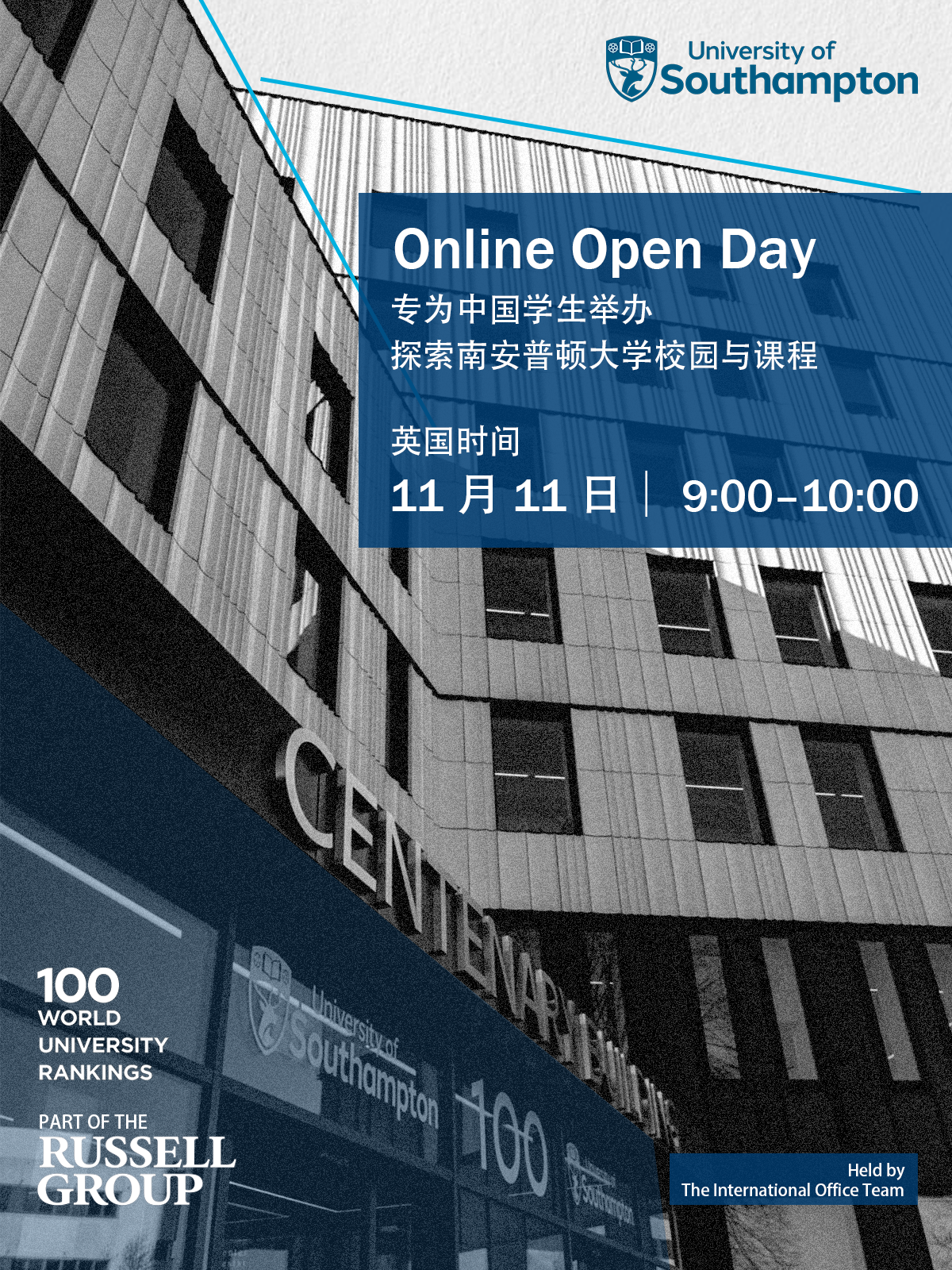
Online Open Day
Bilingual layout targeting prospective Chinese students. Strong typographic hierarchy directs attention to the event date and registration link. Campus photography establishes institutional credibility and location.
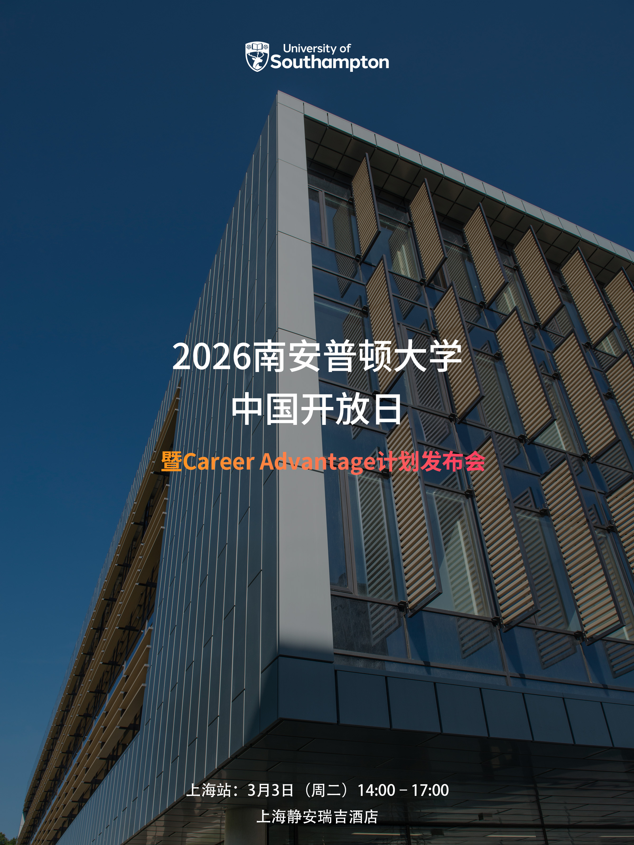
China Open Day — Shanghai
Architectural photography of the University campus grounds the poster in place. Bilingual type stack gives equal visual weight to Chinese and English — a deliberate choice to signal respect for the audience.
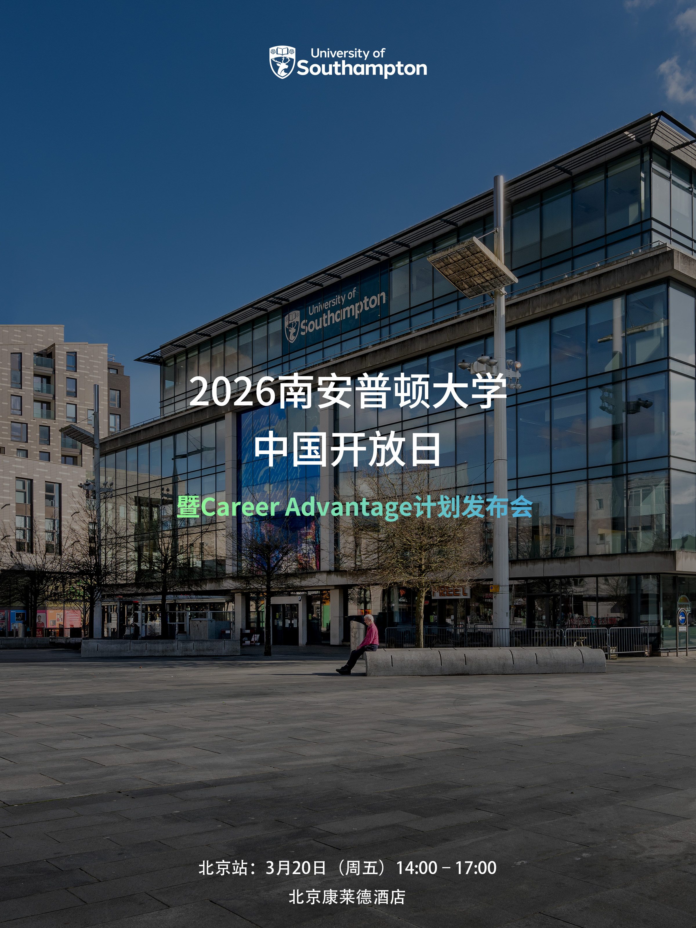
China Open Day — Beijing
A companion to the Shanghai edition, adapted for a different city and venue. Subtle compositional differences distinguish the two while maintaining visual consistency across the campaign pair.
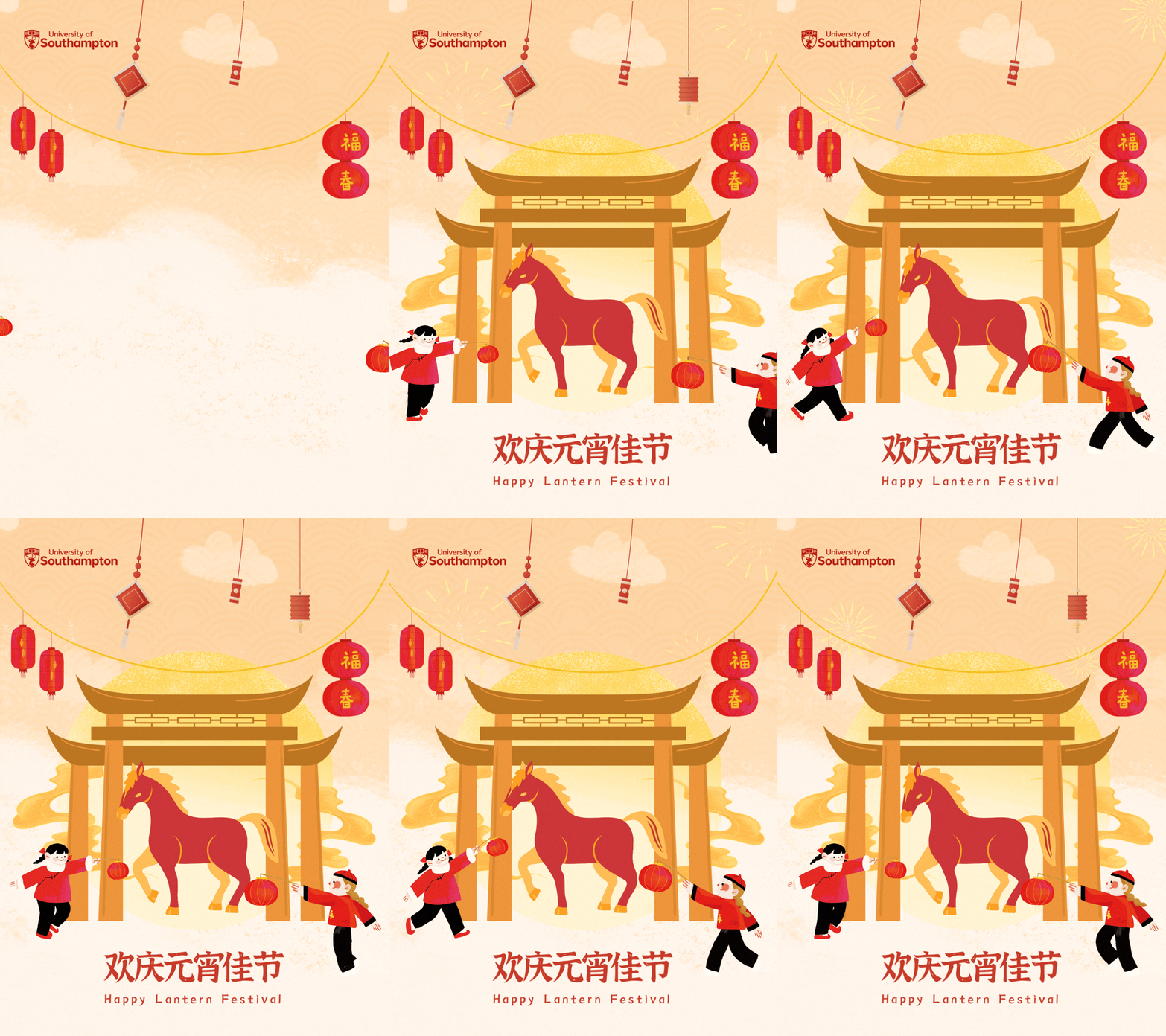
元宵节 Lantern Festival
The most culturally-specific piece in the series. A warm gold and red palette with traditional festive motifs bridges Lantern Festival visual language with the University's brand mark — a deliberate cultural connection.
International Women's Day
Deep navy background with gold accent typography reflects the University's palette while conveying gravitas. Scientific imagery reinforces the institution's commitment to women in research and academia.
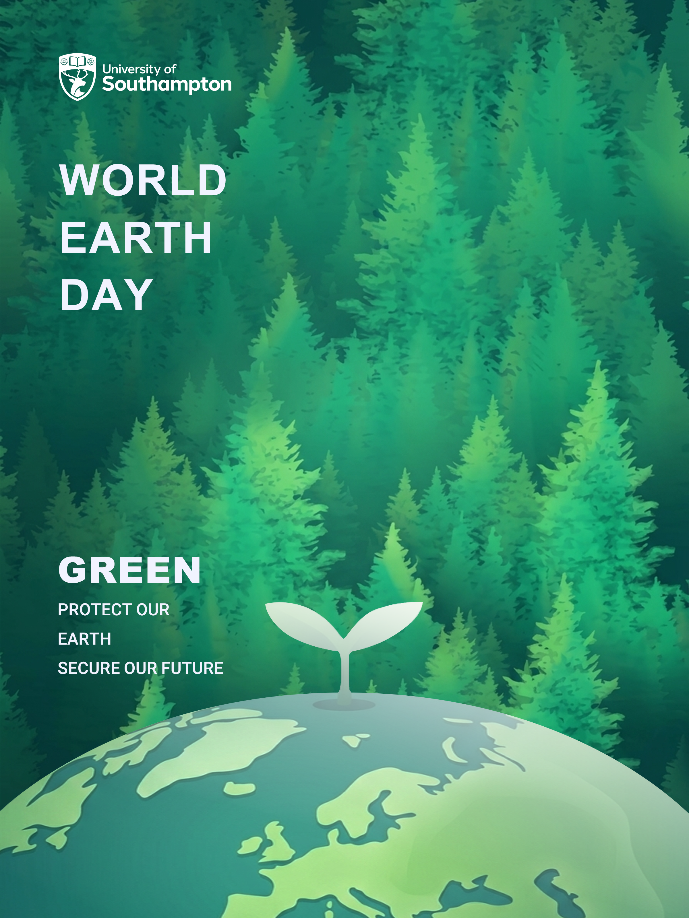
World Earth Day
Immersive forest photography with bold typographic overlay. The green palette steps outside the University's usual blue, signalling environmental content while retaining institutional logo hierarchy.
端午节 Dragon Boat Festival
An animated poster celebrating the Dragon Boat Festival. The dynamic composition — surging waves, an illustrated dragon boat, and soaring birds — brings the energy of the festival to life while the University's brand mark grounds it institutionally.
Principles Behind the Series
Brand Before Trend
Every design decision starts with the University's brand guidelines. Typography, logo placement, and primary colours are fixed — creativity operates within those constraints, not against them.
Bilingual as a Design Element
Rather than treating Chinese text as a translated afterthought, bilingual layouts are designed from the outset — with both languages contributing to the compositional balance and visual rhythm of the piece.
Photography as Evidence
Real campus and event photography is prioritised over illustration. For recruitment materials especially, authentic imagery builds the trust that prospective students need to take action.
One Poster, One Message
Each poster communicates a single primary message. Supporting information (dates, locations, QR codes) is placed in a clear visual hierarchy — present but never competing with the main call to action.
What This Series Taught Me
Constraints as Creative Fuel
Working within institutional brand guidelines felt restrictive at first. Over time, I found that clear constraints actually accelerate creative decision-making — when the colour palette and typography are fixed, energy goes into composition, hierarchy, and cultural nuance instead of starting from scratch each time.
The most interesting challenge was designing for Chinese audiences as an insider: understanding which visual codes signal celebration vs formality, which colour associations differ from Western contexts, and how to balance bilingual text without either language feeling secondary.
Series Thinking
Designing multiple pieces for the same institution taught me to think in systems rather than individual artefacts. Each new poster benefits from — and must visually cohere with — everything that came before. This discipline of consistency while maintaining freshness across pieces is something I now apply to every multi-deliverable project.
Posters designed across events, campaigns, and seasonal occasions
Languages — bilingual English–Chinese design across the series
Audience types — prospective students, staff, and international communities