Project Overview
Goal
Design a CRM marketing email template that improves mobile click-through rate (CTR) while balancing a rich, browsable product display with a calm, on-brand visual experience — the two things that usually pull against each other in retail email design.
Outcome
Two full-length, long-scroll email designs built on the same responsive 4-column grid — a Women's-led "Summer Statement" send, and a broader Primark brand send that opens on a full-body hero and moves through knitwear, trousers, and accessories. Scroll either phone above to explore the whole send.
A Responsive 4-Column Grid System
Retail CRM emails live or die on mobile, where most opens actually happen, but they still need to work in desktop inboxes and show enough product to feel worth opening. The solution was a modular 4-column grid: every section of the email — hero banner, category tiles, product carousels — is built from the same underlying column structure, so blocks can be resized, reordered, or dropped for a new send without breaking the layout.
Once the grid is doing the work, richness stops being a trade-off against clarity — you can show more product without the layout feeling crowded, because everything still lines up.
Modular 4-Column Grid
A single underlying grid powers every module — hero, category tiles, product rows — so new sends can be assembled quickly from existing, tested blocks.
Mobile-First Construction
Layouts are designed at mobile width first, then scaled up, since the majority of CRM opens happen on a phone screen.
Consistent Cross-Device Layout
The same grid logic renders predictably across screen sizes and email clients, so the campaign looks intentional whether it's opened on mobile or desktop.
Reusable Building Blocks
Hero banners, category tiles, and product grids are treated as interchangeable components — reducing design time for each new seasonal send.
Six Screens Across the Campaign
Each design was exported as a set of scroll captures — the actual frames used to check spacing, alignment, and pacing down the length of the send. Tap any frame to zoom in.
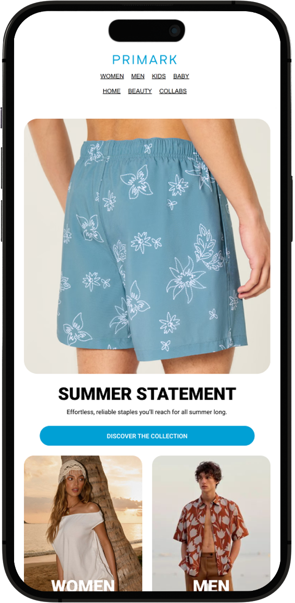
Mockup 1
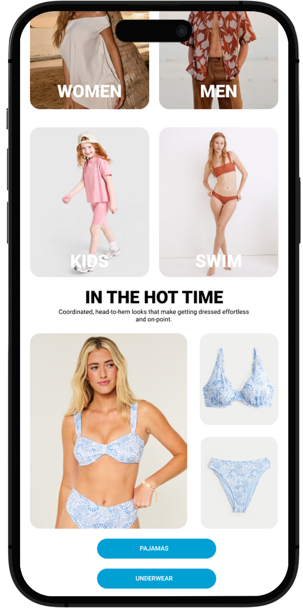
Mockup 2
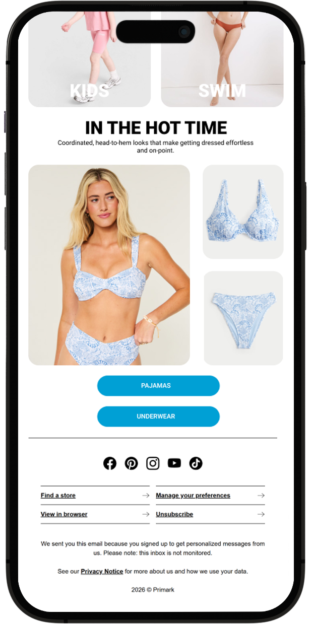
Mockup 3
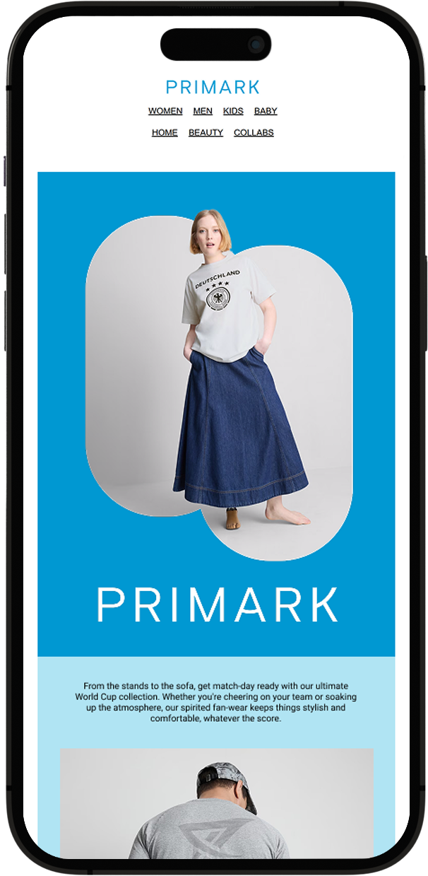
Mockup 4
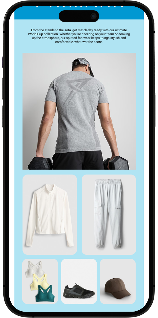
Mockup 5
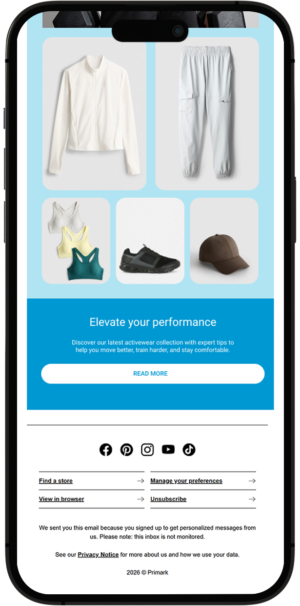
Mockup 6
Anatomy of a Send
Both designs are built from the same modular grid, but each opens with a different emotional register — one led by a single product moment, the other by a full brand statement. Scroll either preview to read it top to bottom.
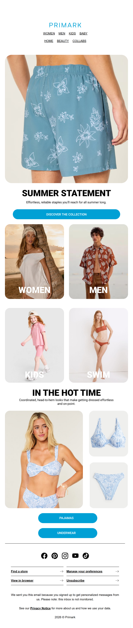
Summer Statement — Women
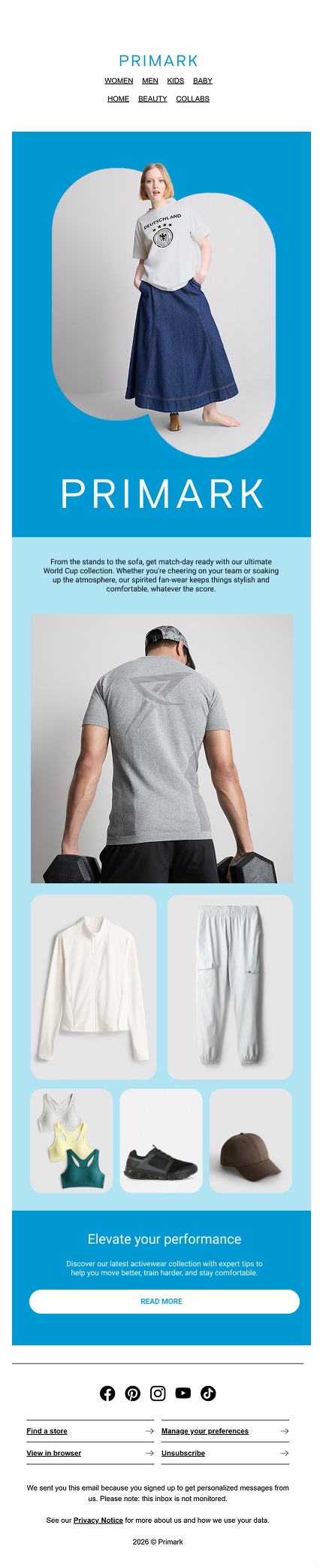
Primark Campaign Send
What Held the System Together
Visual Hierarchy
Every send opens with a strong hero image to capture attention immediately, with the key CTA button placed within natural thumb reach to lift conversion on mobile.
Brand Alignment
Primark's colour scheme and typography guidelines are followed strictly across every email, so recognition holds even when the audience or product focus changes.
Modular Construction
The 4-column grid underpins every module, letting hero banners, category tiles, and product carousels be recombined for new sends without starting the layout from scratch.
Consistency Across Screens
The same layout logic renders reliably across screen sizes and email clients — so richness never comes at the cost of a broken layout.
What This Campaign Taught Me
Grids as a Content Strategy, Not Just Layout
The 4-column grid wasn't just a way to line things up — it turned out to be a content decision. Once every block understood its own width, the question stopped being "how do we fit more product in" and became "which grid combination best serves this particular send." That shift made it much easier to plan a whole campaign of related but distinct emails without each one feeling like a fresh design problem.
Designing specifically for the thumb also changed how I think about hierarchy. On mobile, the CTA isn't just something you see — it's something your hand has to reach, and that physical constraint turned out to matter as much as the visual one.
Balancing Richness and Restraint
Retail CRM emails are under constant pressure to show "just one more product." The modular grid gave me a way to say yes to that pressure without the layout losing its calm — because the structure, not the amount of content, is what keeps the email feeling intentional.
Column modular grid system underpinning every email module
Full-length email designs, built from one shared grid system
Days spent on the practice brief, start to finish