Project Overview
Background
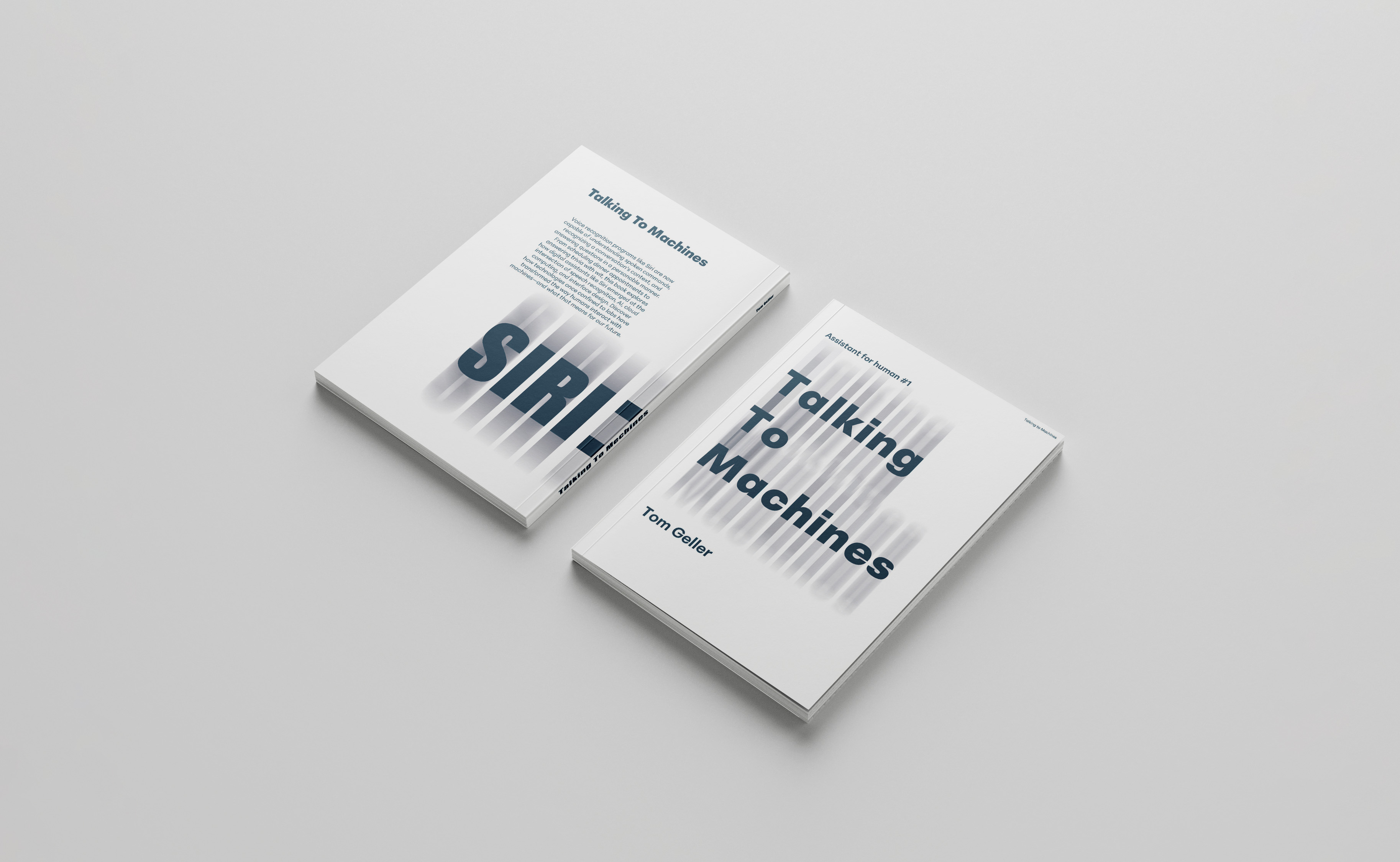
Based on Tom Geller's essay exploring how voice assistants like Siri understand human speech, this project translates a technology-focused text into a printed publication. The challenge was to make invisible computational processes — vocabulary balancing, accent recognition, natural language parsing — feel tangible and readable through graphic design.
Outcome
A near-A5 printed book structured across four chapters: Talking to Machines, Executing Commands, Learning and Organizing, and Measures of Success. The publication combines halftone collage imagery, retro GUI aesthetics, maze-like metaphors, and a restrained blue-grey-black palette to embody the tensions between human language and machine logic.
The Design Process
Design Rationale
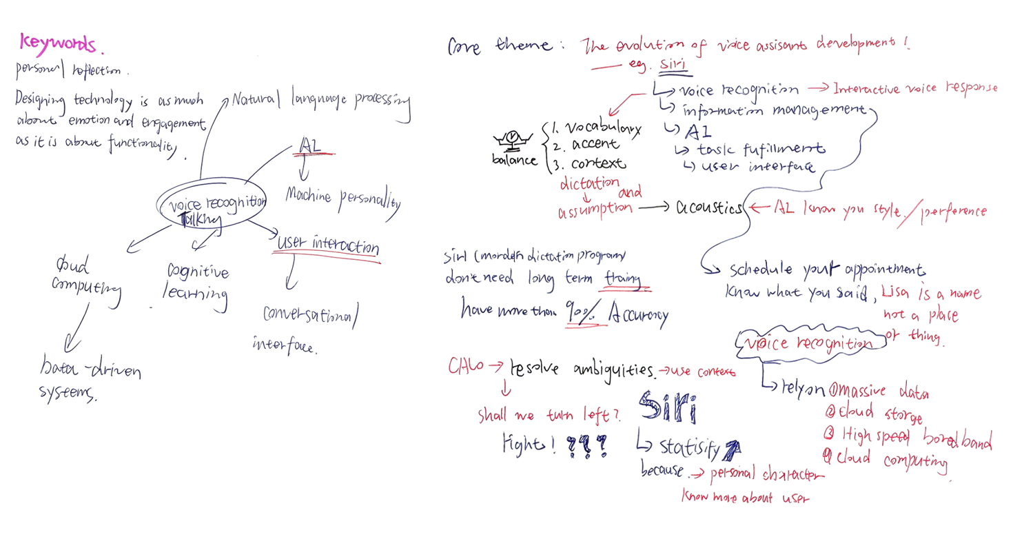
The source essay was analysed and divided into six conceptual themes: integration of technologies, speech recognition methods, learning and organising information, data and training, user experience, and limitations. These themes guided both the book's structural division into four chapters and the visual language applied throughout.
Designing technology is as much about emotion and engagement as it is about functionality.
— Design concept note, SketchbookCore Visual Decisions
Each visual element was chosen to reinforce the project's central tension: the collision between fluid, imprecise human speech and the rigid, rule-based logic of machine processing.
Structure: Four Chapters
01 · Talking to Machines
Introduction to how voice assistants enable machines to understand human speech. Features soundwave typography and minimalist layout.
02 · Executing Commands
Exploring the process of converting spoken commands into machine-executed actions. Uses halftone collage and retro Photoshop UI overlay.
03 · Learning and Organizing
How AI systems organise information from interactions to improve performance. Features a bold blue chapter opener and maze diagram.
04 · Measures of Success
Evaluating voice assistant effectiveness beyond accuracy, focusing on user experience. Halftone portrait and highlighted text treatment.
Research & Layout Exploration
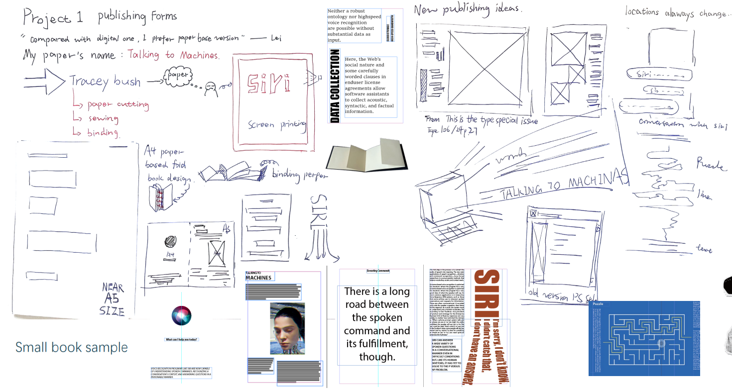
The sketchbook documents the full conceptual and formal journey from reading the essay through to final print. Keyword extraction, layout wireframing, reference gathering, and format testing were all recorded here before any digital production began.
Format Development
Following tutor feedback, the book shifted from A4 to a near-A5 format — more intimate, more considered. Variations in size, margin, and font weight were explored across many iterations, with an emphasis on making the book feel playful as a physical object, not merely legible as a document.
Keyword-to-Visual Translation
Keywords were extracted from chapter titles and the opening and closing paragraphs of each section. These keywords — soundwave, maze, retro software, collage, data — directly determined the visual forms used throughout the book.
Soundwave
Speech as visible data — rendered as a waveform on the opening spread to visualise voice input.
Maze
Metaphor for the complexity of natural language processing — used as a full-bleed illustration on blue stock.
Retro GUI
An ironic contrast: an old Windows-era interface hosting a modern AI — friction as concept.
Halftone Collage
Analog-digital hybrid imagery reflecting the collision between human expression and machine processing.
Book Prototype
The full book prototype is embedded below — showing the cover, interior spreads, chapter openers, collage pages, and final layout decisions across all four sections.
Project Sketchbook
The sketchbook documents research, conceptual mapping, and formal experimentation behind the publication — from early essay analysis and visual references through layout tests and keyword extraction, to final typography and colour decisions.
Key Takeaways
What I learned
• Printed books can simulate digital interaction: By embedding metaphors of computation — mazes, waveforms, retro interfaces — a static printed object can evoke the feel of an interactive, speech-based technology.
• Restraint as a design tool: Limiting the palette to blue, grey, and black forced every compositional choice to carry meaning. Colour became content, not decoration.
• Keyword extraction shapes visual language: Pulling concepts directly from the source text — rather than illustrating generally — produced visual decisions that were grounded, justifiable, and cohesive.
• Format is content: Shifting from A4 to a near-A5 format changed not just the proportions but the entire register of the book — from document to object.
Limitations & next steps
Current limitations
• The retro GUI spreads rely on screen-legible text at small size — printing at near-A5 compresses these layouts and reduces readability.
• Some collage imagery sits compositionally heavy on the left-hand pages, creating imbalance across spreads.
Future directions
• Interactive edition: Develop a digital counterpart using motion, sound, and interactive elements to extend the book's themes into an actual voice-interface experience.
• Extended visual system: Apply the Peridot PE Variable typeface across a wider range of weights and sizes to build richer typographic hierarchy within chapters.
Chapters structured from the original three-part essay
Core conceptual themes extracted through sketchbook research
Final format — chosen for physical intimacy over document authority